3D lettering is a technique used in advertising to create visually striking and attention-grabbing text. It involves the manipulation of typography to give the illusion of depth and dimension, making the letters appear three-dimensional. This technique has been used in advertising for many years, but with advancements in technology, it has become even more prevalent in modern advertising campaigns.
The history of 3D lettering in advertising can be traced back to the early 20th century when artists and designers began experimenting with different techniques to create depth and dimension in their work. One of the earliest examples of 3D lettering can be seen in the iconic Coca-Cola logo, which was first introduced in the late 19th century. The logo features bold, three-dimensional lettering that has become synonymous with the brand.
In today’s competitive advertising landscape, it is more important than ever for brands to stand out and make a lasting impression on consumers. 3D lettering offers a unique and eye-catching way to do just that. By incorporating this technique into their advertising campaigns, brands can create a sense of depth and dimension that captures the attention of consumers and leaves a lasting impression.
Understanding the Importance of 3D Lettering in Advertising
One of the key reasons why 3D lettering is important in advertising is its ability to enhance brand identity. The use of three-dimensional text can help to create a strong visual identity for a brand, making it instantly recognizable and memorable. When consumers see a brand’s logo or slogan rendered in 3D lettering, it creates a sense of professionalism and quality, which can help to build trust and loyalty.
In addition to enhancing brand identity, 3D lettering also has a significant impact on consumer perception. Studies have shown that three-dimensional text is more likely to capture and hold the attention of viewers compared to traditional two-dimensional text. This increased attention can lead to higher levels of engagement and recall, ultimately influencing consumer behavior and purchase decisions.
There have been numerous successful 3D lettering campaigns that have made a lasting impact on consumers. One example is the “Got Milk?” campaign, which featured three-dimensional lettering that appeared to be made of milk. This campaign was highly successful in creating a memorable and engaging message that resonated with consumers.
Tools and Techniques for Crafting 3D Lettering in Advertising
To create 3D lettering in advertising, designers need access to the right tools and techniques. In terms of software, there are several options available, including Adobe Illustrator, Photoshop, and Cinema 4D. These programs allow designers to manipulate typography and create three-dimensional effects.
In addition to software, designers also need access to hardware such as a computer or laptop with sufficient processing power and a graphics tablet for precise control over the design process. These tools enable designers to create high-quality 3D lettering that is visually appealing and impactful.
There are several techniques that can be used to create 3D lettering in advertising. One common technique is extrusion, which involves taking a two-dimensional letterform and giving it depth by pulling it outwards. Another technique is beveling, which involves adding a slanted edge to the letterform to create the illusion of depth.
When creating 3D lettering, it is important to pay attention to detail and ensure that the design is of high quality. This includes using clean lines, smooth curves, and consistent lighting throughout the design. It is also important to consider the placement of the lettering within the overall composition and how it interacts with other design elements.
The Role of Typography in 3D Lettering Advertising
Typography plays a crucial role in 3D lettering advertising as it sets the tone and style of the design. The choice of typography can greatly impact the overall look and feel of the 3D lettering, and it is important to choose a font that aligns with the brand’s identity and message.
When selecting typography for 3D lettering, it is important to consider factors such as legibility, readability, and scalability. The font should be easily readable from a distance and at different sizes. It should also be scalable so that it can be used across different mediums and platforms.
In addition to legibility and scalability, it is also important to consider the style and personality of the font. Different fonts evoke different emotions and can convey different messages. For example, a bold and blocky font may convey strength and power, while a script font may convey elegance and sophistication.
There have been many successful examples of typography in 3D lettering advertising. One example is the Nike logo, which features a bold and dynamic font that conveys a sense of energy and athleticism. Another example is the Google logo, which uses a clean and modern font that reflects the brand’s innovative and forward-thinking nature.
Creating a Visual Hierarchy with 3D Lettering in Advertising
Creating a visual hierarchy is an important aspect of any design, including 3D lettering in advertising. A visual hierarchy helps to guide the viewer’s eye through the design and prioritize the most important elements.
One way to create a visual hierarchy with 3D lettering is through size and scale. By making certain letters or words larger than others, designers can draw attention to specific parts of the design. For example, in a slogan or tagline, designers may choose to make the most important words larger to emphasize their importance.
Another way to create a visual hierarchy is through color. By using contrasting colors or shades, designers can create depth and dimension within the 3D lettering. This can help to make certain parts of the design stand out and catch the viewer’s attention.
It is important to balance the 3D lettering with other design elements to create a cohesive and visually appealing composition. This can be achieved through the use of negative space, color, and texture. By carefully considering the placement and interaction of the 3D lettering with other design elements, designers can create a visually pleasing and impactful design.
The Psychology of 3D Lettering in Advertising

The psychology of 3D lettering in advertising is a fascinating aspect that can greatly influence consumer behavior. The use of color, shape, and texture in 3D lettering can evoke certain emotions and create a subconscious connection with the viewer.
Color is one of the most powerful tools in advertising, and it plays a significant role in 3D lettering. Different colors have different psychological effects on viewers. For example, red is often associated with energy and excitement, while blue is associated with trust and reliability. By carefully selecting colors for 3D lettering, designers can create a desired emotional response from viewers.
Shape is another important aspect of 3D lettering that can influence consumer behavior. Different shapes have different psychological associations. For example, sharp angles and edges may convey a sense of strength and power, while soft curves may convey a sense of elegance and femininity. By choosing the right shape for 3D lettering, designers can create a desired psychological effect.
Texture is also an important consideration in 3D lettering advertising. The use of texture can add depth and dimension to the design, creating a tactile experience for viewers. For example, a rough texture may convey a sense of ruggedness or authenticity, while a smooth texture may convey a sense of luxury or sophistication.
There have been many successful examples of psychological tactics in 3D lettering advertising. One example is the McDonald’s logo, which features bold yellow lettering that is associated with happiness and positivity. Another example is the Apple logo, which features sleek and minimalist lettering that is associated with innovation and sophistication.
Exploring Different Styles of 3D Lettering in Advertising
There are many different styles of 3D lettering that can be used in advertising, each with its own unique look and feel. Some common styles include block lettering, script lettering, and graffiti lettering.
Block lettering is a popular style that features bold and geometric letterforms. This style is often used in advertising to convey strength and power. It is commonly seen in sports-related campaigns or brands that want to make a bold statement.
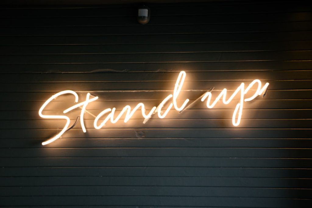
Script lettering, on the other hand, is a more elegant and flowing style that mimics handwriting. This style is often used in advertising to convey sophistication and luxury. It is commonly seen in beauty or fashion-related campaigns or brands that want to evoke a sense of elegance.
Graffiti lettering is a more urban and edgy style that mimics street art. This style is often used in advertising to convey a sense of rebellion or youthfulness. It is commonly seen in campaigns targeting a younger demographic or brands that want to appear edgy and cool.
When choosing the right style for your brand, it is important to consider factors such as the brand’s identity, target audience, and message. The style should align with the brand’s personality and resonate with the target audience.
Best Practices for Using 3D Lettering in Advertising
To use 3D lettering effectively in advertising, there are several best practices to keep in mind. First, it is important to ensure that the design is visually appealing and impactful. This includes using clean lines, smooth curves, and consistent lighting throughout the design.
Second, it is important to consider the placement of the 3D lettering within the overall composition. The lettering should be positioned in a way that is visually balanced and harmonious with other design elements. It should also be legible and easily readable from a distance.
Third, it is important to consider the scalability of the 3D lettering. The design should be able to be used across different mediums and platforms, such as print, digital, and outdoor advertising. It should also be able to be resized without losing quality or legibility.
Finally, it is important to test the design with a target audience before launching a campaign. This can help to ensure that the design is effective in capturing attention and conveying the desired message. Feedback from the target audience can also provide valuable insights for further refinement.
There are also common mistakes to avoid when using 3D lettering in advertising. One common mistake is using too many different styles or fonts in one design. This can create a cluttered and confusing composition that is difficult to read and understand.
Another common mistake is using excessive effects or embellishments in the design. While it is important to create depth and dimension with 3D lettering, it is also important to keep the design clean and simple. Excessive effects can distract from the message and make the design appear cluttered.
Case Studies: Successful Examples of 3D Lettering in Advertising
There have been many successful examples of 3D lettering campaigns that have made a lasting impact on consumers. One example is the “Just Do It” campaign by Nike, which features bold and dynamic 3D lettering that conveys a sense of energy and motivation. This campaign has become iconic and has helped to solidify Nike’s position as a leader in the sports industry.
Another example is the “Share a Coke” campaign by Coca-Cola, which features 3D lettering that appears to be made of ice or bubbles. This campaign was highly successful in creating a personal connection with consumers by featuring their names on the bottles. It also helped to increase sales and brand loyalty.
A third example is the “Think Different” campaign by Apple, which features sleek and minimalist 3D lettering that conveys a sense of innovation and creativity. This campaign was highly successful in positioning Apple as a leader in the technology industry and has become synonymous with the brand.
These case studies highlight the importance of using 3D lettering effectively in advertising. By creating visually appealing and impactful designs, brands can capture attention, convey their message, and create a lasting impression on consumers.
Future Trends in 3D Lettering Advertising: What’s Next?
As technology continues to advance, there are several emerging trends in 3D lettering advertising that are worth noting. One trend is the use of augmented reality (AR) and virtual reality (VR) to create immersive and interactive experiences for consumers. Brands can use these technologies to bring their 3D lettering to life and engage consumers in new and exciting ways.
Another trend is the use of motion graphics and animation in 3D lettering advertising. By adding movement to the design, brands can create dynamic and engaging content that captures attention and holds the viewer’s interest. This trend is particularly effective in digital advertising where animations can be easily incorporated.
In addition to AR, VR, and motion graphics, there is also a growing trend towards customization and personalization in 3D lettering advertising. Brands are increasingly using data and technology to create personalized experiences for consumers, such as incorporating their names or personal messages into the design. This trend helps to create a deeper connection with consumers and increase engagement.
To stay ahead of the curve in 3D lettering advertising, it is important for brands to embrace these emerging trends and experiment with new techniques and technologies. By staying up-to-date with the latest advancements, brands can continue to create innovative and impactful designs that capture attention and resonate with consumers.
In conclusion, 3D lettering is a powerful and effective technique in advertising that can enhance brand identity, influence consumer perception, and create a lasting impression. By using the right tools and techniques, selecting the appropriate typography, creating a visual hierarchy, understanding the psychology behind 3D lettering, exploring different styles, and following best practices, brands can create visually appealing and impactful designs that capture attention and resonate with consumers.
Through case studies, we have seen the success of 3D lettering campaigns by brands such as Nike, Coca-Cola, and Apple. These campaigns have made a lasting impact on consumers and have helped to solidify these brands’ positions in their respective industries.
Looking ahead, there are several emerging trends in 3D lettering advertising, including the use of AR and VR, motion graphics and animation, and customization and personalization. By embracing these trends and staying ahead of the curve, brands can continue to create innovative and impactful designs that capture attention and resonate with consumers.
In conclusion, the art of 3D lettering in advertising is a powerful tool that can help brands stand out in today’s competitive landscape. By incorporating this technique into their advertising campaigns, brands can create visually striking and attention-grabbing designs that leave a lasting impression on consumers. So why not give it a try in your own advertising campaigns?
If you’re interested in the art of 3D lettering in advertising, you might also enjoy reading about the wide range of signage options available at Simply Signs. From shop signs to vehicle graphics, their website offers a variety of visually stunning solutions to help businesses stand out. Check out their online shop at https://simplysigns-nw.co.uk/shop/ for a glimpse into the world of eye-catching signage. For more information about their services and to explore their portfolio, visit their main website at https://simplysigns-nw.co.uk/. Additionally, their blog at https://simplysigns-nw.co.uk/blog/ provides valuable insights and tips on effective advertising strategies.
FAQs
What is 3D lettering in advertising?
3D lettering in advertising refers to the use of three-dimensional letters or typography in advertising campaigns. It involves creating letters that appear to have depth and dimension, giving them a more realistic and eye-catching appearance.
What are the benefits of using 3D lettering in advertising?
Using 3D lettering in advertising can help to make a brand or product stand out from the competition. It can also help to create a more memorable and impactful message, as the letters are more visually engaging and attention-grabbing.
What tools are used to create 3D lettering in advertising?
There are a variety of tools that can be used to create 3D lettering in advertising, including computer software such as Adobe Illustrator, Cinema 4D, and Maya. Some designers may also use traditional techniques such as sculpting or hand-drawing to create 3D lettering.
What are some examples of successful 3D lettering in advertising?
Some examples of successful 3D lettering in advertising include the Coca-Cola logo, which features three-dimensional letters that appear to be popping off the page, and the Nike “Just Do It” campaign, which uses bold, three-dimensional typography to convey a sense of strength and determination.
What are some tips for creating effective 3D lettering in advertising?
Some tips for creating effective 3D lettering in advertising include choosing a font that is easy to read and visually appealing, using contrasting colours to make the letters stand out, and experimenting with different lighting and shading techniques to create a sense of depth and dimension. It is also important to consider the overall message and tone of the advertising campaign when designing 3D lettering.
We’re a team of creatives who are excited about unique ideas and help fin-tech companies to create amazing identity by crafting top-notch signage.


